Client
Sava Hotels & Resorts
Sava Hotels & Resorts
Agency
M&C Saatchi
M&C Saatchi
Expertise
Brand Identity,
Art Direction
Brand Identity,
Art Direction
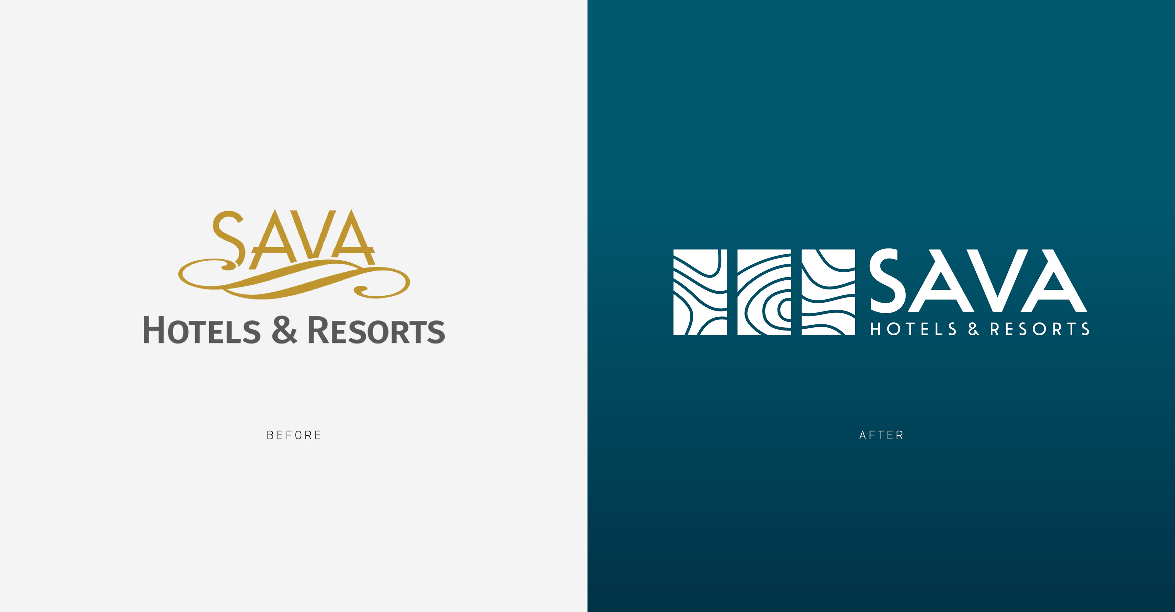
Sava Hotels & Resorts is one of the largest hospitality groups in Slovenia, offering a wide range of accommodation options, wellness services, and recreational activities.
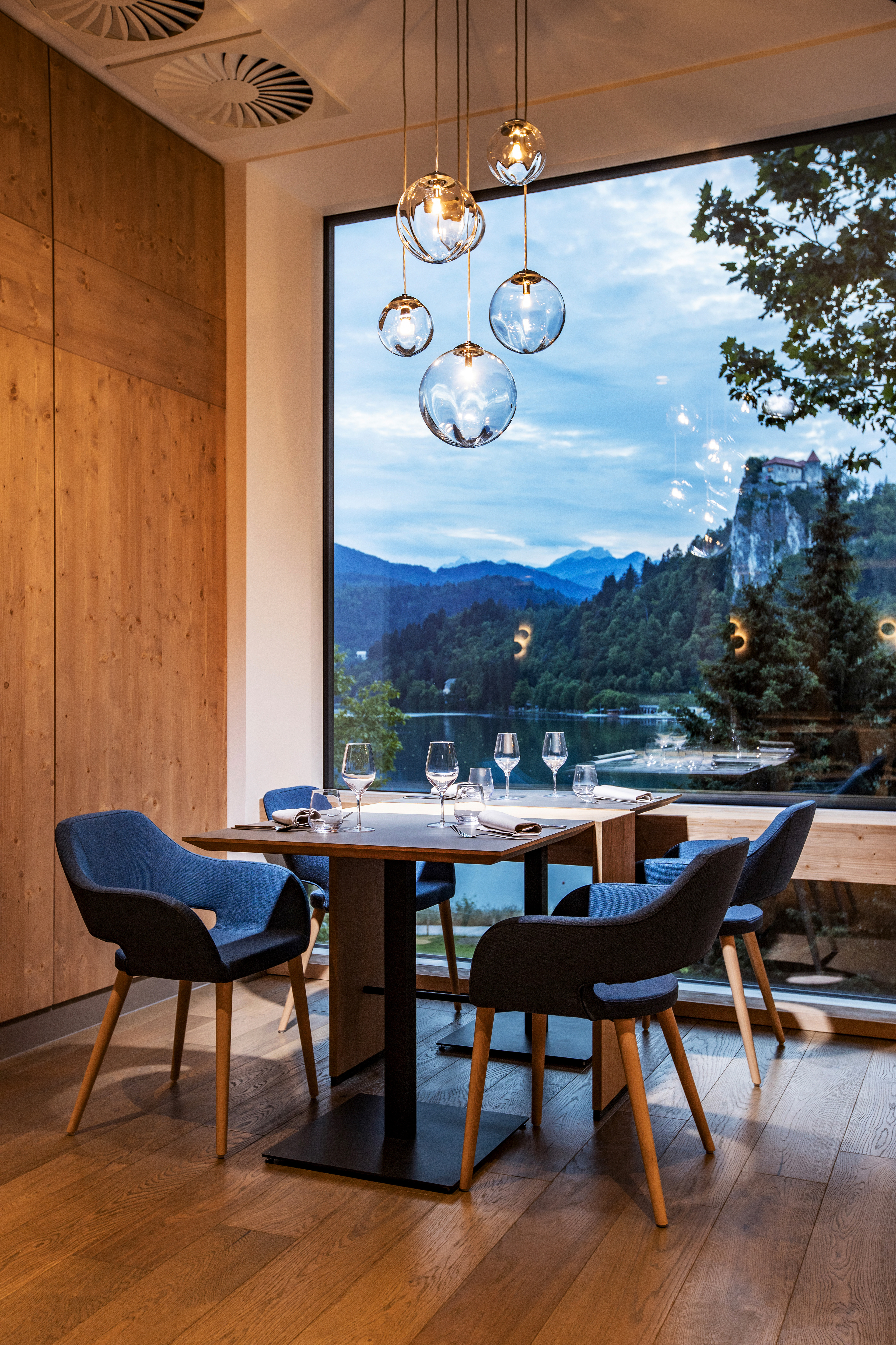
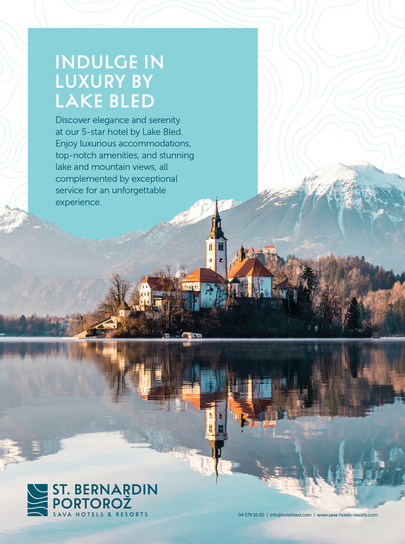
Following a merger with properties on the Slovenian coast, Sava Hotels & Resorts can now offer a complete Slovenian experience, from the Alps to the Adriatic. To unify and strengthen its brand across their diverse accommodations – hotels, resorts, campsites, and wellness facilities – Sava needed a new visual identity.
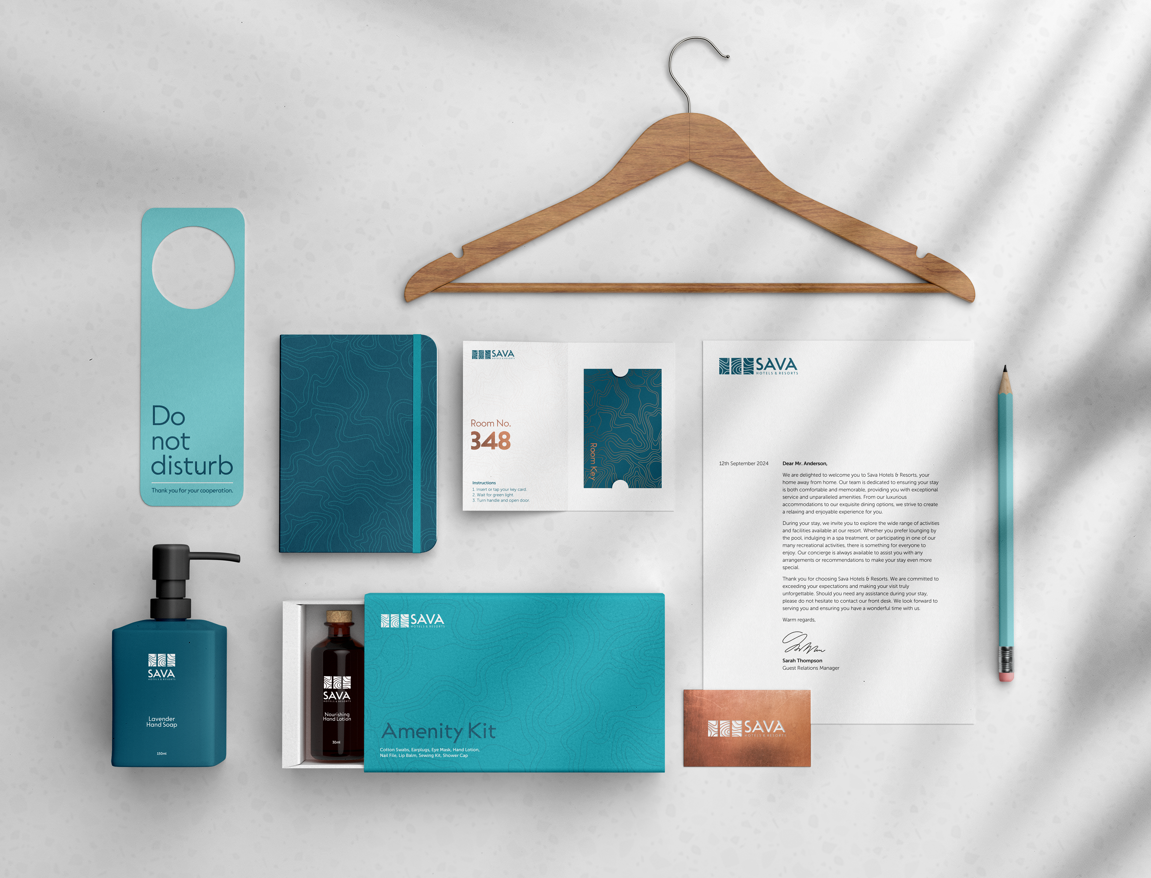
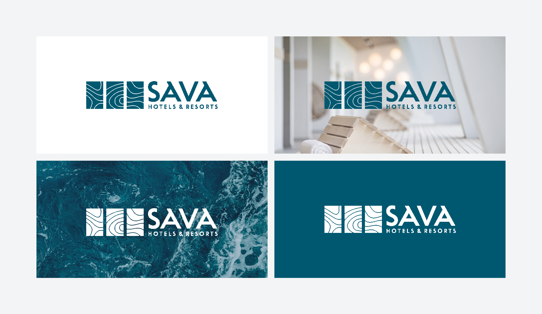
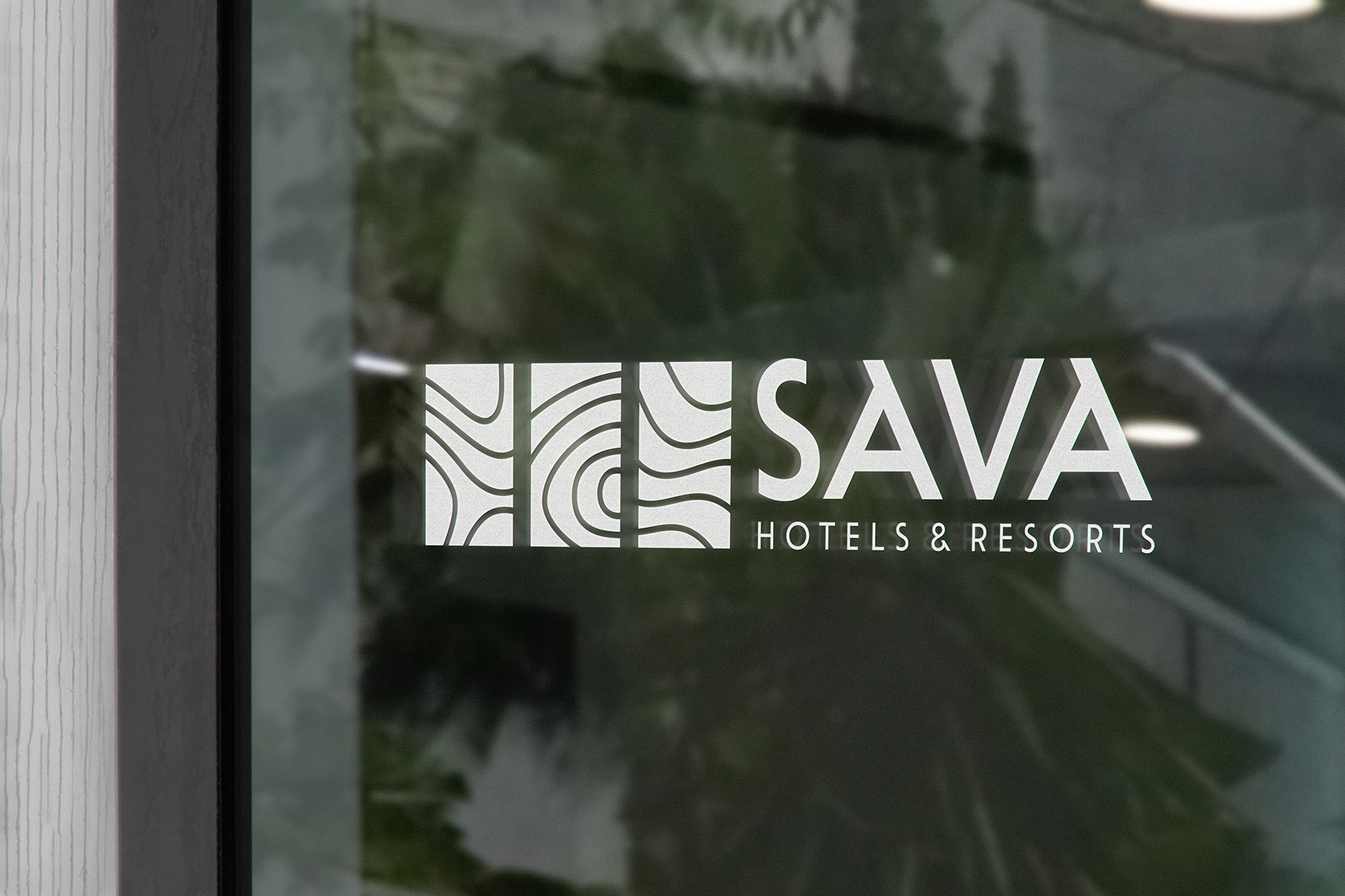
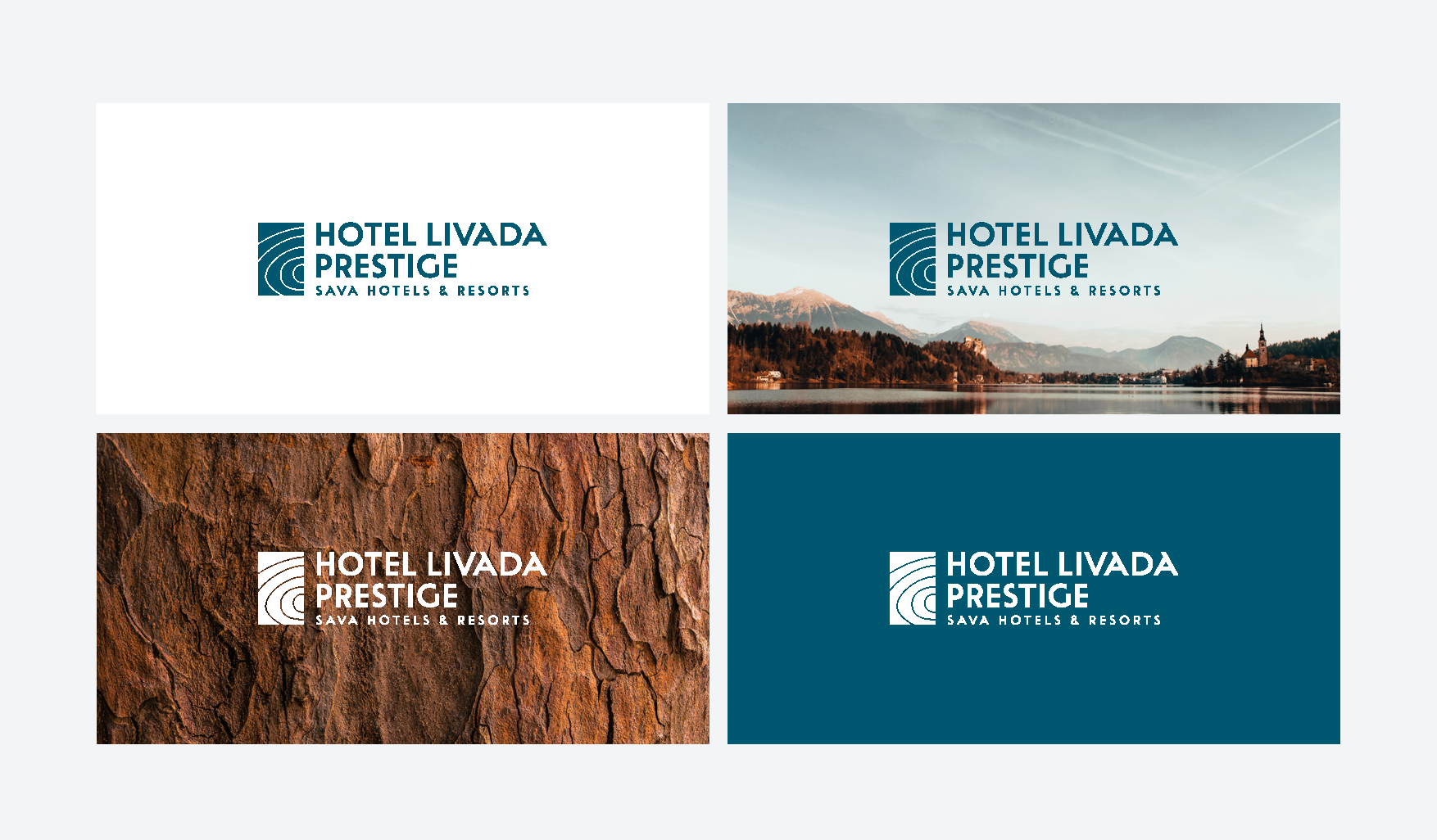
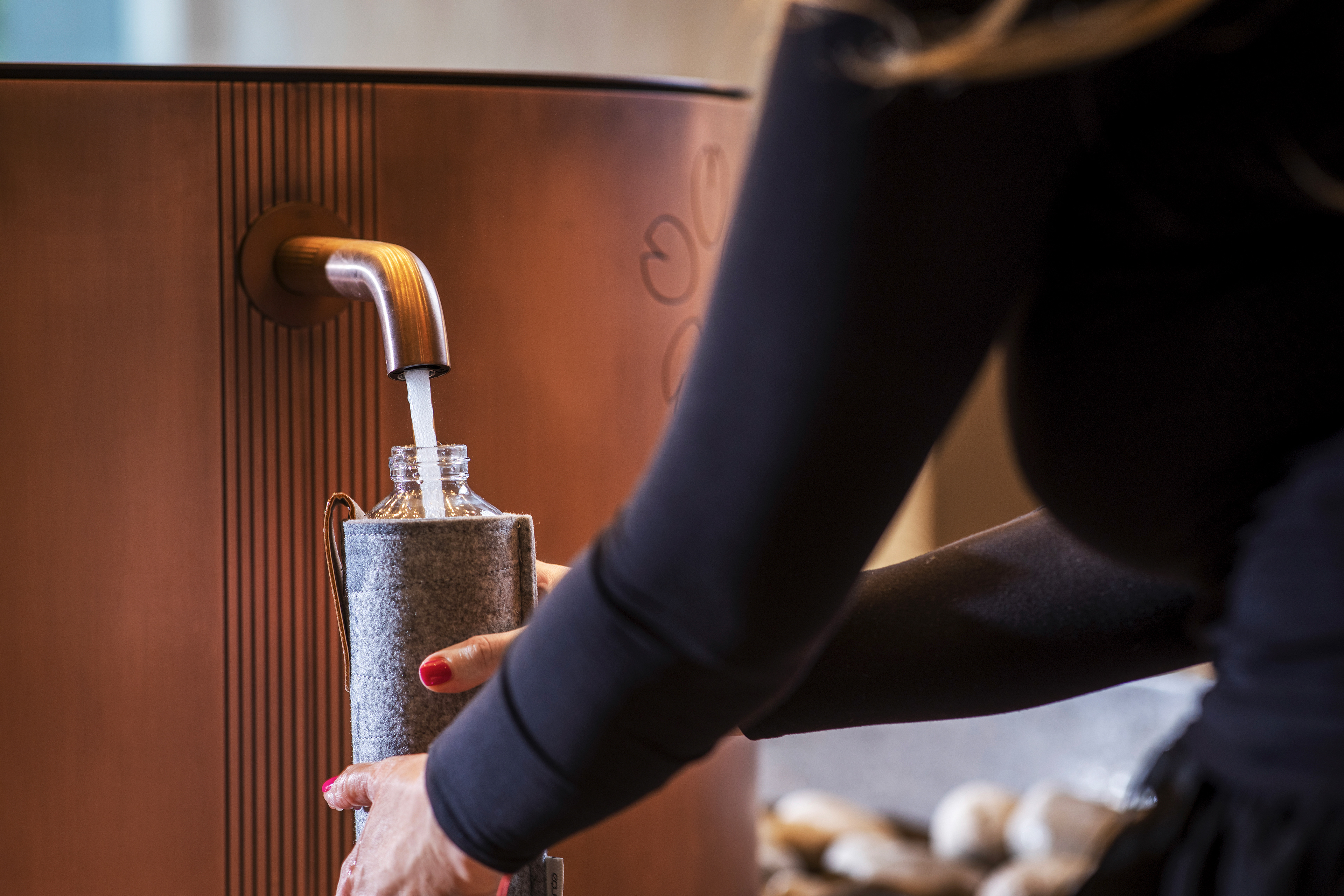
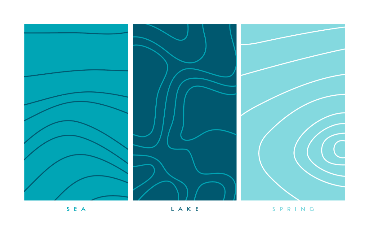
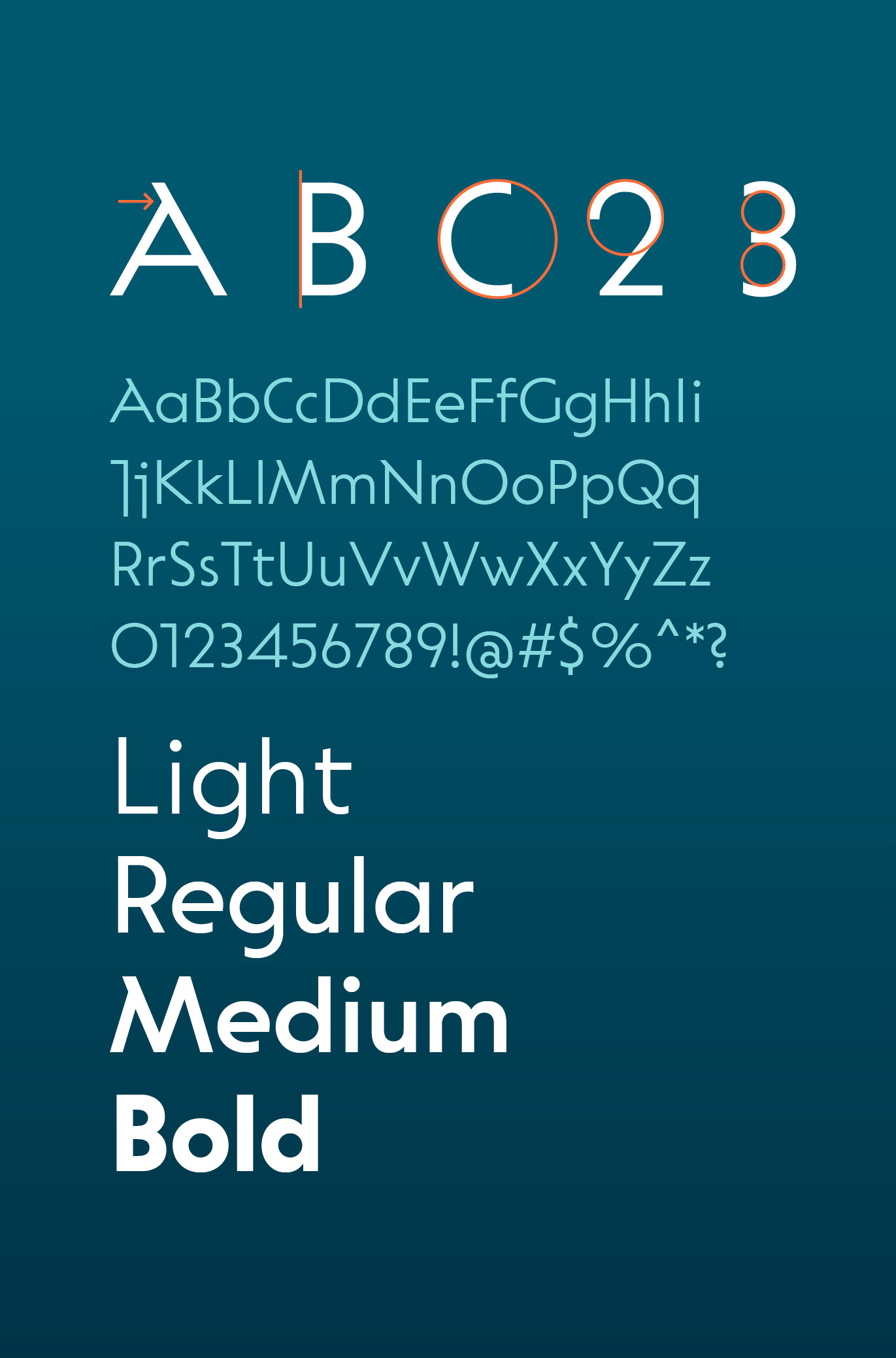
Emphasising the importance of water, locations are categorised into sea, spring and lake, reflecting the significance of the Sava river, one of Europe’s longest. A blue colour palette and graphic elements inspired by the movements of water are complemented by beautiful photography, to create a harmonious and visually appealing brand identity. The Plecnik typeface, named after Slovenian architect Jože Plečnik, reflects his classical architectural style through its elegant forms, humanist stroke endings and offers a modern, elegant style with unique and memorable shapes.