Client
LOIS Medical
LOIS Medical
Agency
Theresa Hartlieb
Theresa Hartlieb
Expertise
Brand Identity,
Art Direction
Brand Identity,
Art Direction
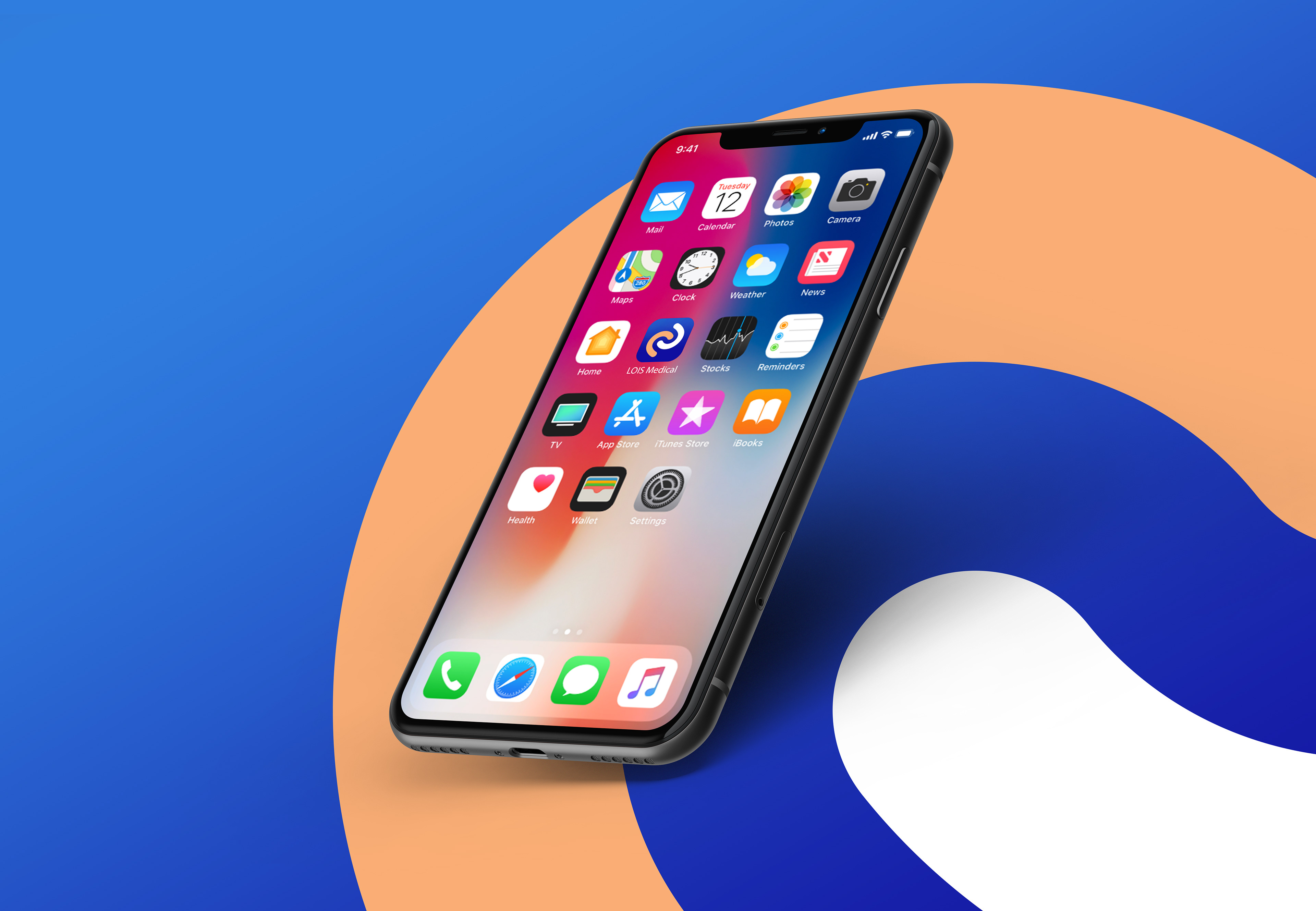
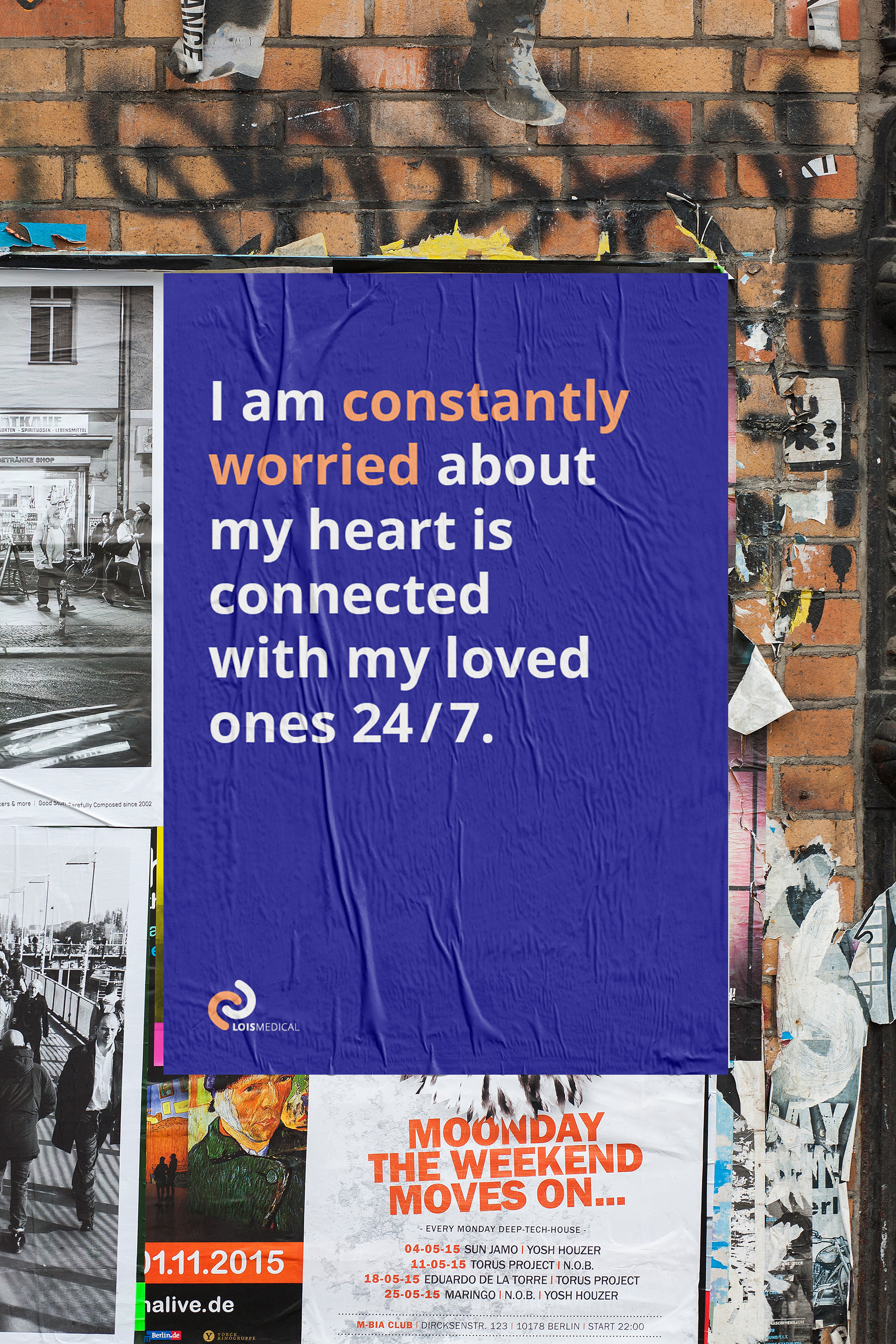
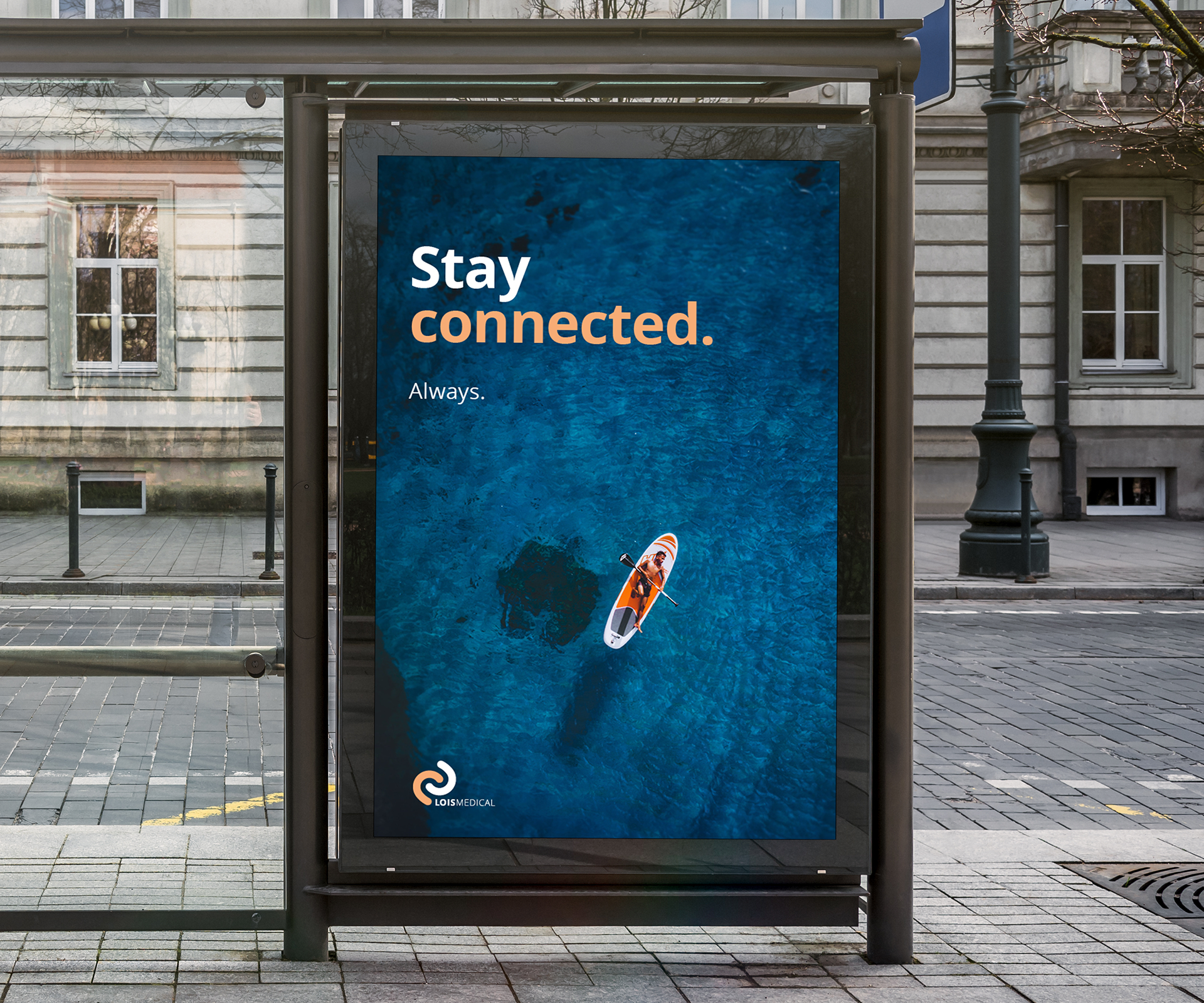
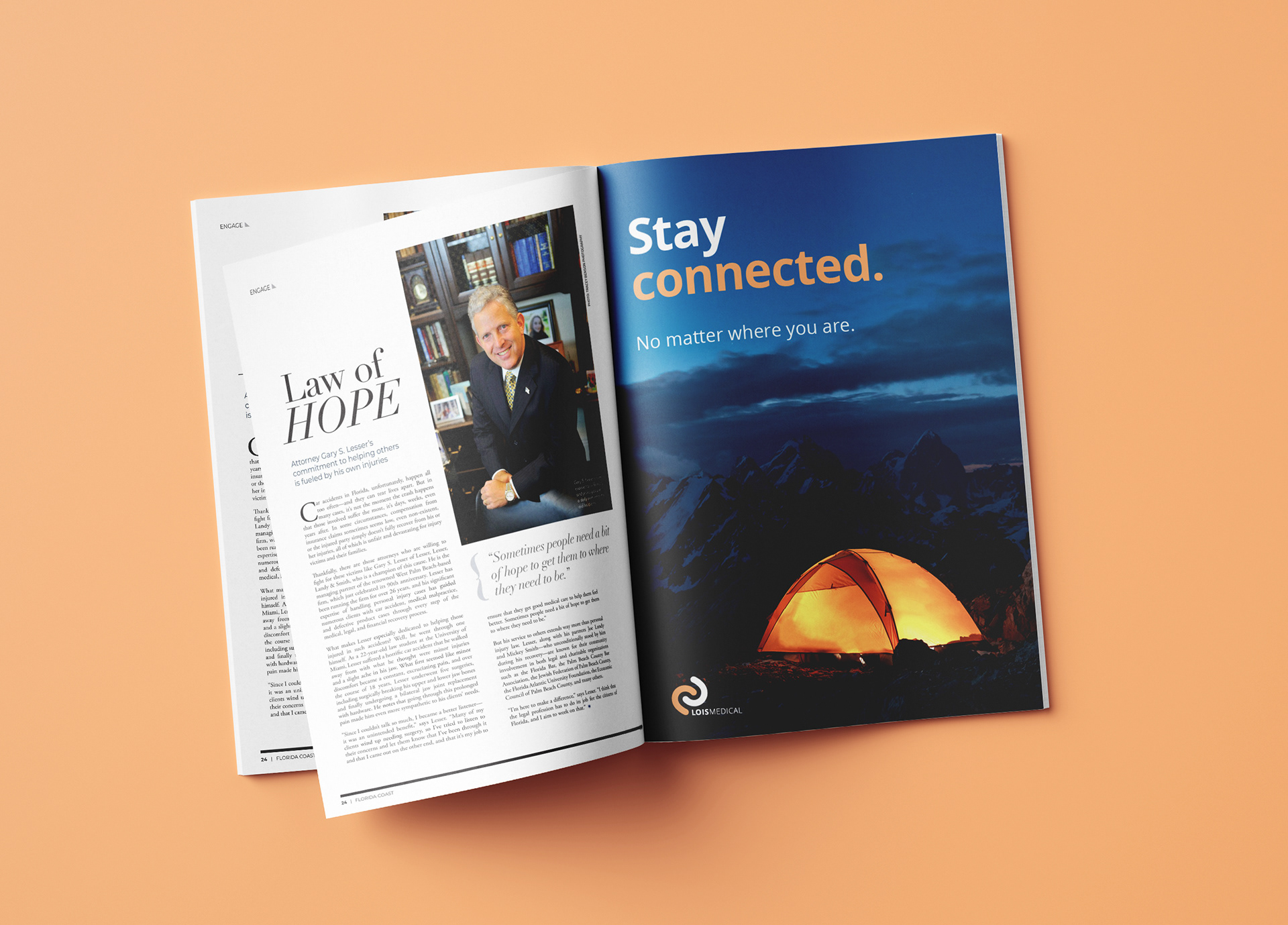
LOIS Medical is a start-up dedicated to enhancing safety and connectivity for individuals with Implantable Cardioverter Defibrillators (ICDs). The company provides a wearable device that alerts loved ones when a high-energy shock is delivered, enabling prompt assistance and ensuring patients and their families remain connected at all times. LOIS Medical serves not only the patients with ICD implants but also their families and friends. The experience of having an ICD can be daunting, with concerns about being alone when the device activates or experiencing irregular heart rhythms potentially impacting one's well-being and hindering recovery. This sense of isolation can delay progress and affect the return to an independent lifestyle.
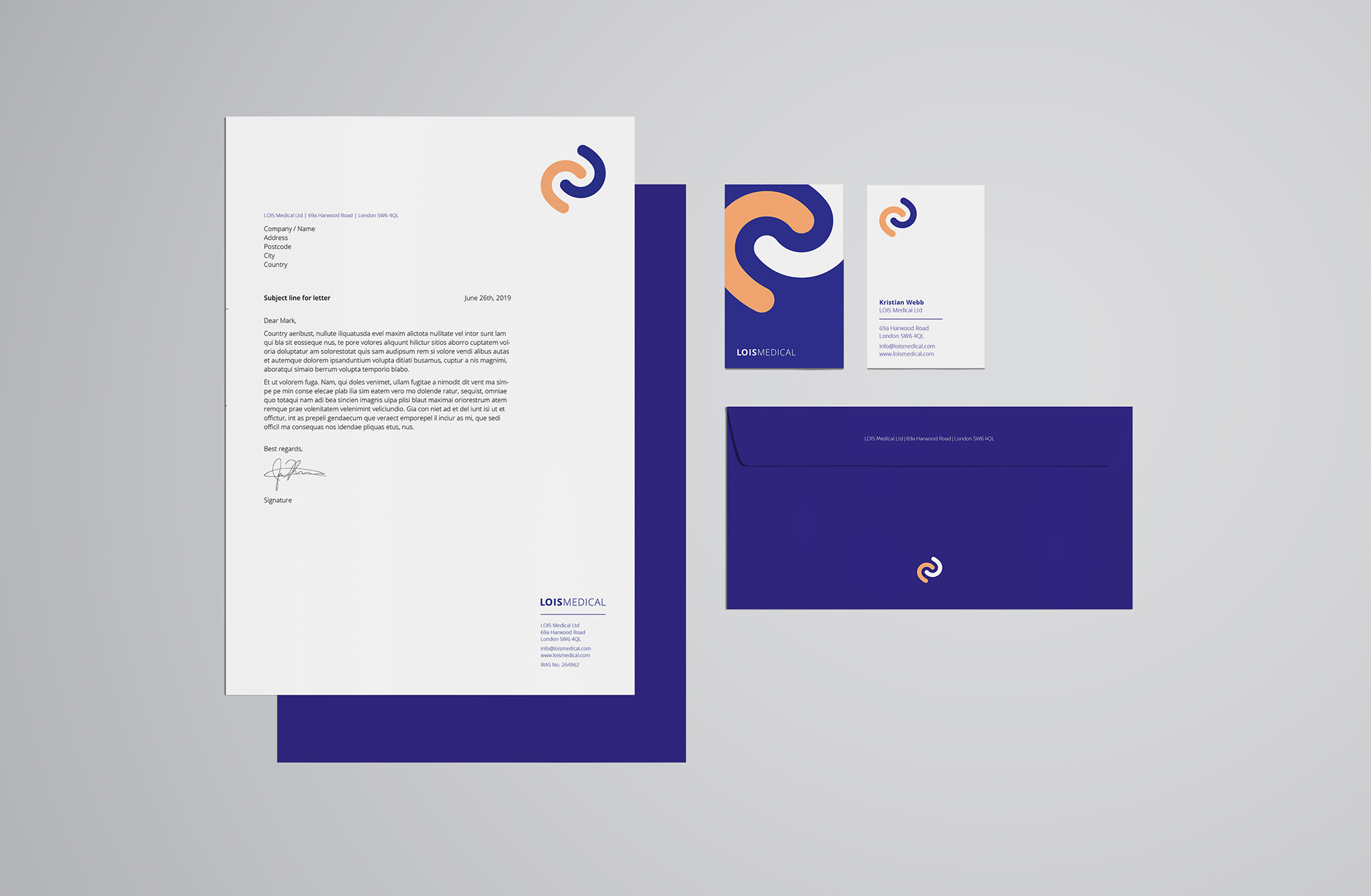
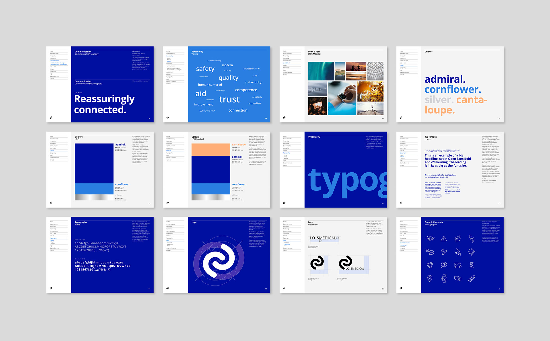
The logo features a geometric arrangement of multiple circles, symbolising safety, protection, connection, and life. The circular design underscores the brand’s focus on human-centric care, representing warmth, safety, and trust. The abstract form conveys the idea of mutual support, with interconnected elements reflecting the dependence between individuals. The colour palette is chosen to evoke reliability, reassurance, affection, and warmth, while the corporate font is designed to appear human and organic, suggesting high quality and trust. Imagery of individuals engaged in adventurous activities reinforces the notion of maintaining an independent lifestyle, even with an ICD.