Client
Homebase
Homebase
Agency
Atomic London
Atomic London
Expertise
Brand Identity,
Art Direction
Brand Identity,
Art Direction
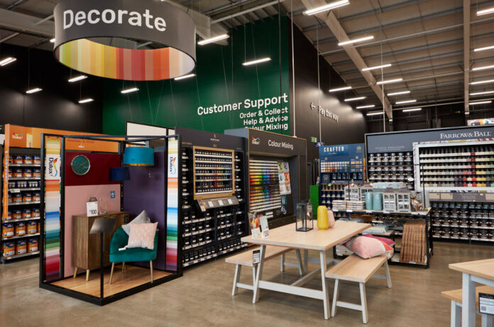
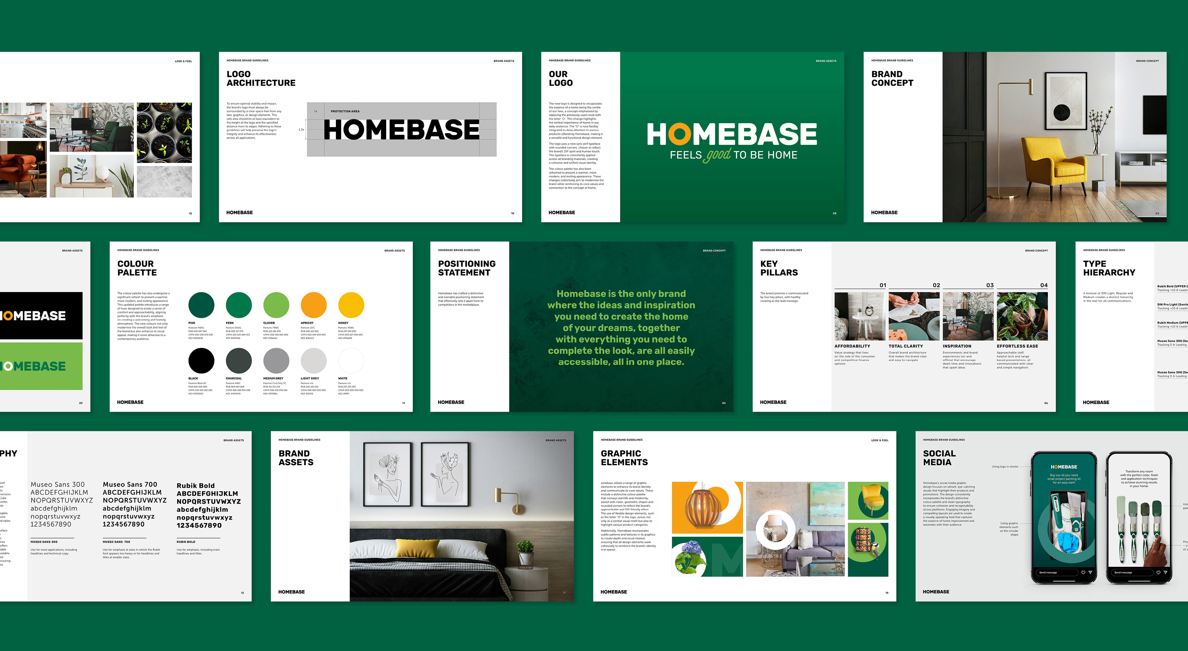
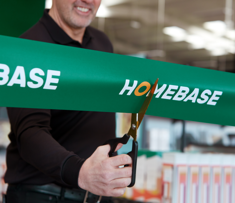
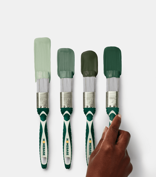
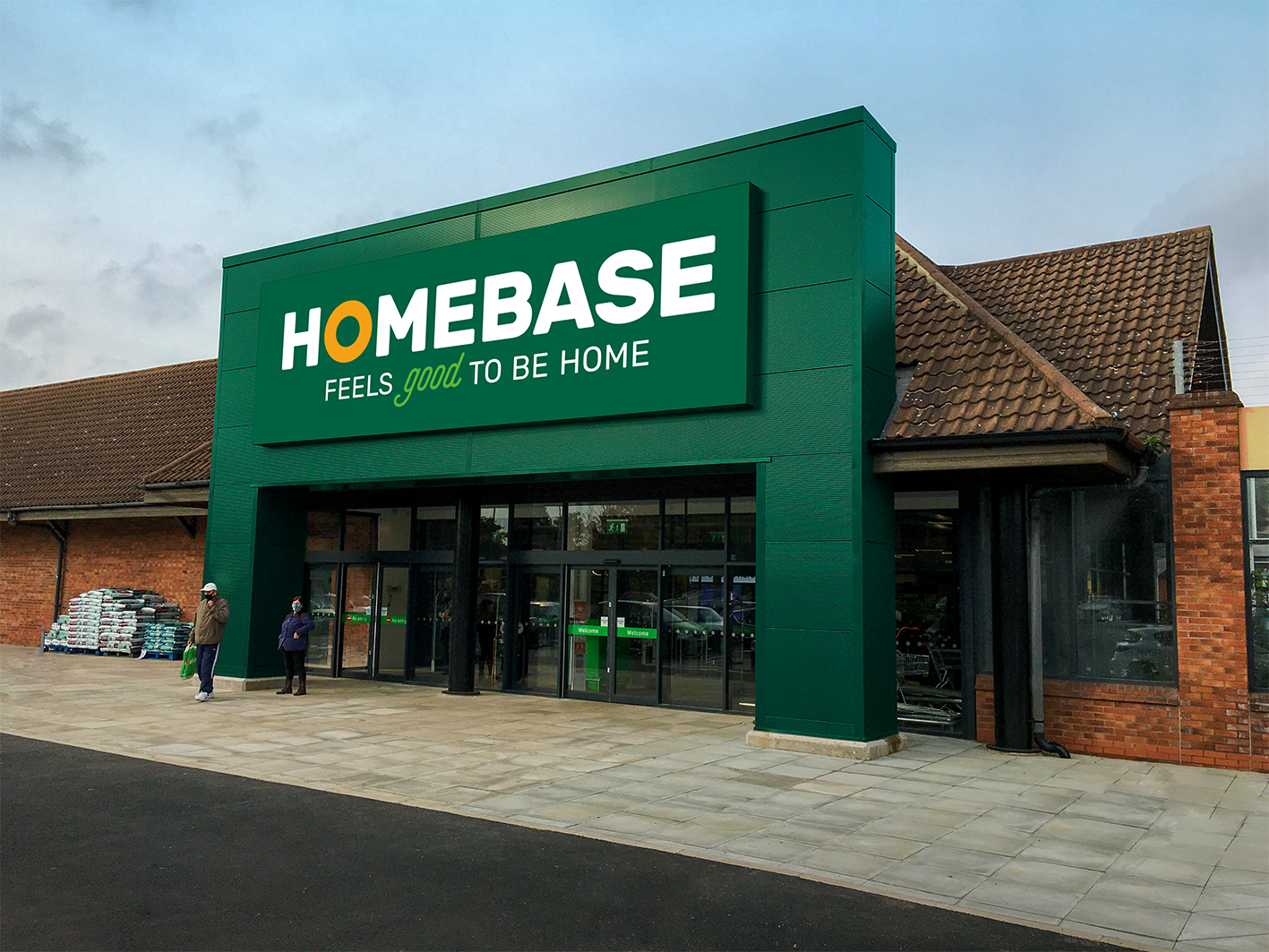
Homebase refreshed its stores and introduced new small-format shops on the high street, also updating their logo to reflect these changes.
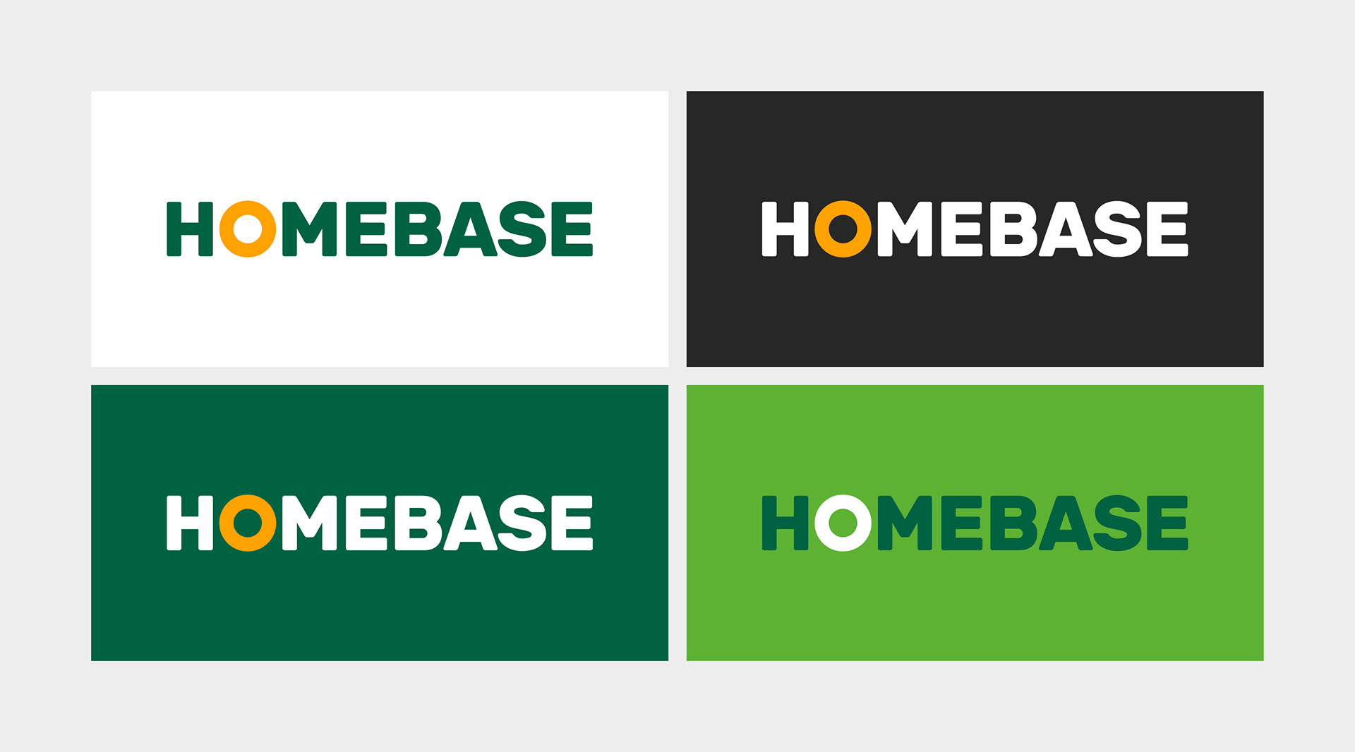
The new logo encapsulates the idea of a home being more than just four walls: it is a place where we spend most of our time and where significant life events happen. It features a modified “O” to symbolise “a home as the center of our lives,” and uses a rounded sans serif typeface to emphasise the DIY and human aspects of the brand. The updated colour palette offers a warmer and more modern look.